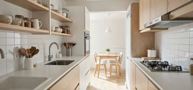
A small kitchen can create a sense of space if every choice of material, color, and furniture serves a dual purpose: facilitating movement and lightening visual perception. The classic trap is to pile on decorative tricks without considering whether they block a drawer or complicate a daily action. Here are ten concrete ideas that visually enlarge your kitchen without sacrificing ergonomics.
1. Continuous finish facades and countertops to eliminate fragmentation
Further reading : Building an Eco-Friendly Home: Keys to a Healthy and Sustainable Habitat
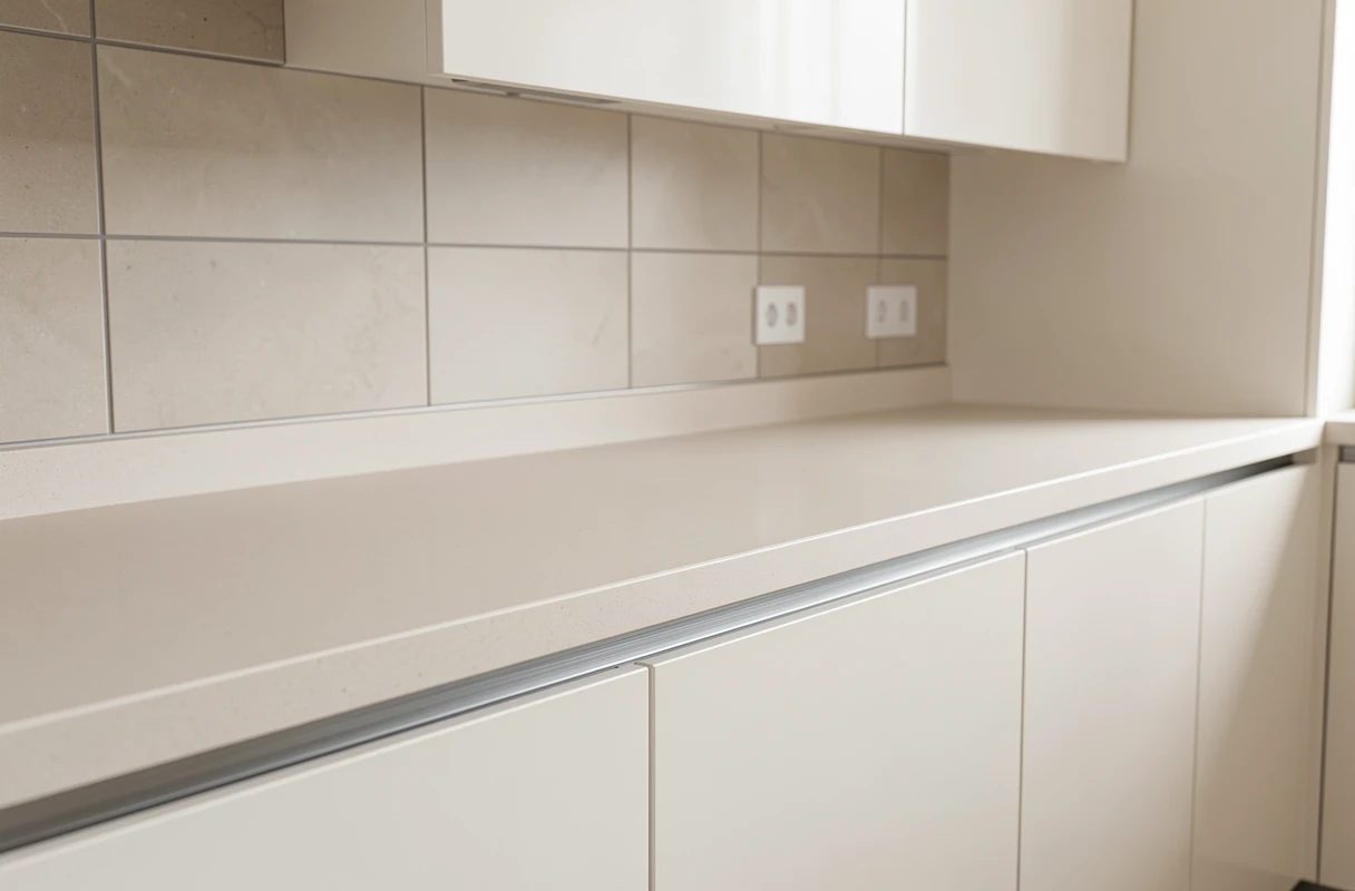
Have you ever noticed that a change in material at mid-height visually splits a wall in two? This is one of the most common reflexes in small kitchens, and it reduces the feeling of space. Several designers recommend using a continuous countertop and facades, without a change in finish between the bottom and top of the furniture.
Specifically, choose the same shade or finish for the base cabinets, backsplash, and upper cabinets. The eye no longer encounters a break, making the wall appear longer. This logic of continuous surface works particularly well with light tones and satin finishes that reflect light.
See also : The best senior home exercise ideas to stay fit
Several tips for enlarging a kitchen on Archi Line detail this principle of visual continuity applied to small spaces.
2. Deep drawers instead of doors on base cabinets
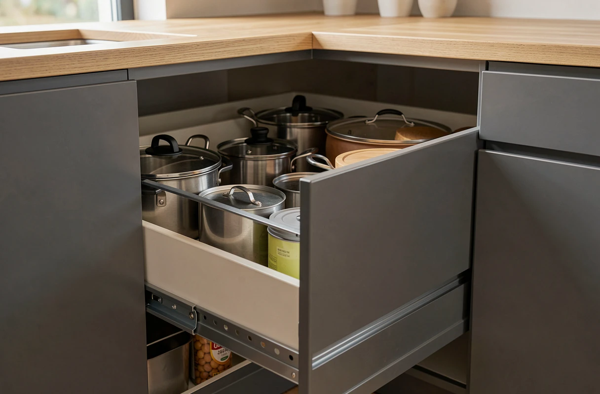
Swinging doors on base cabinets require bending down and searching blindly. The contents remain hidden, which encourages clutter. Designers consulted in recent sources now favor deep drawers to improve storage visibility.
An open drawer shows all its contents at a glance. Fewer unnecessary movements, fewer forgotten items at the back. The result: you organize better, store less unnecessary items, and the kitchen remains clear on a daily basis.
3. Plinth drawers and pull-out corner modules to utilize lost areas
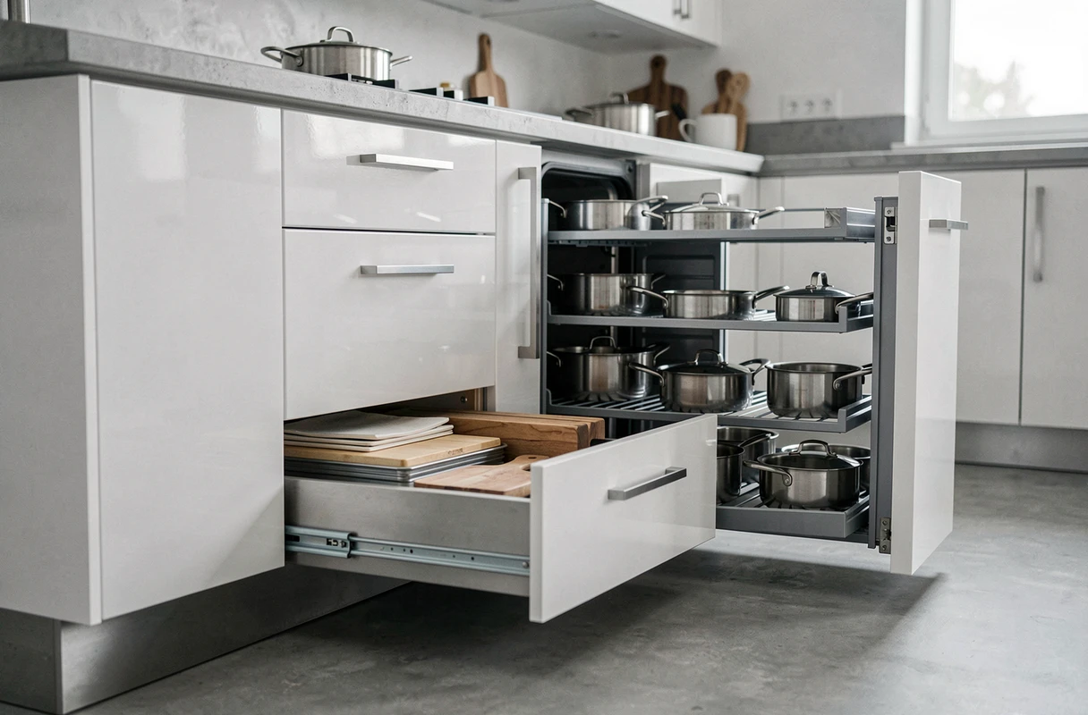
Under each base cabinet, the plinth hides a dead space of several centimeters in height. Plinth drawers transform this space into storage for baking sheets, flat molds, or dish towels.
Pull-out corner modules follow the same logic. Instead of a corner cupboard where everything disappears, a rotating tray or sliding drawer makes every centimeter accessible. Less visible clutter, more fluidity in movement.
4. Cool colors and light shades to push back the walls
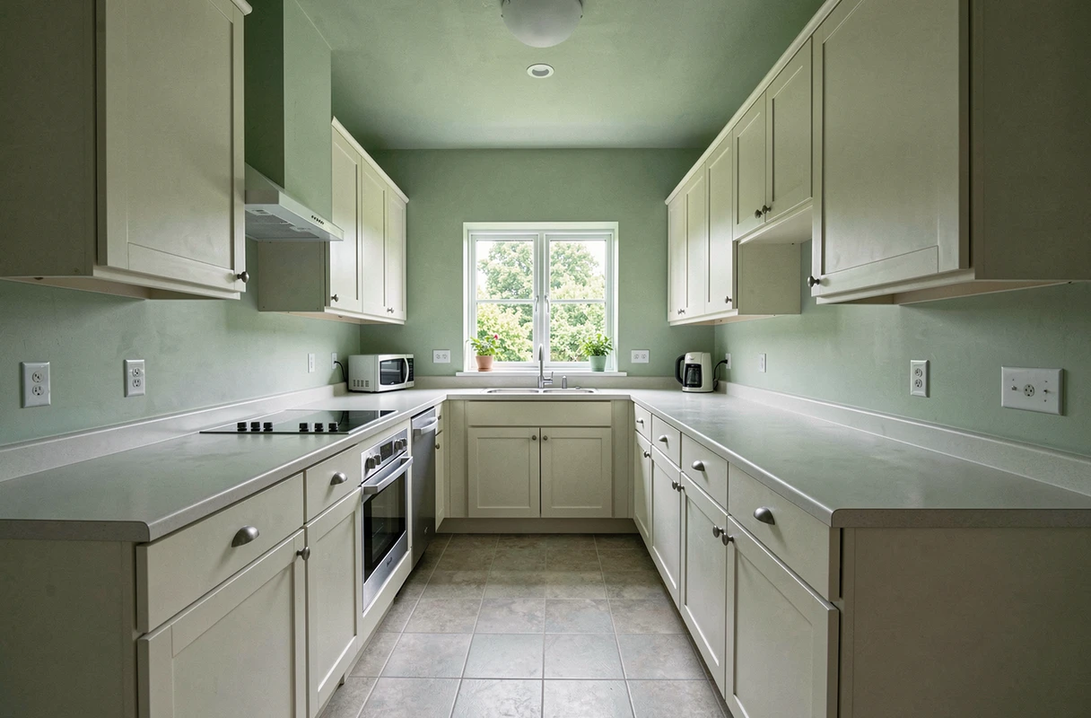
White and light gray remain safe bets, but they are not the only options. Celadon blue, lime green, or rosy beige work just as well to create a sense of space, as long as you stick to cool or desaturated tones.
For a kitchen open to the living room, choosing the same paint as the adjacent room eliminates the visual boundary between the two spaces. The effect is immediate.
5. Layered lighting to eliminate shadowy areas
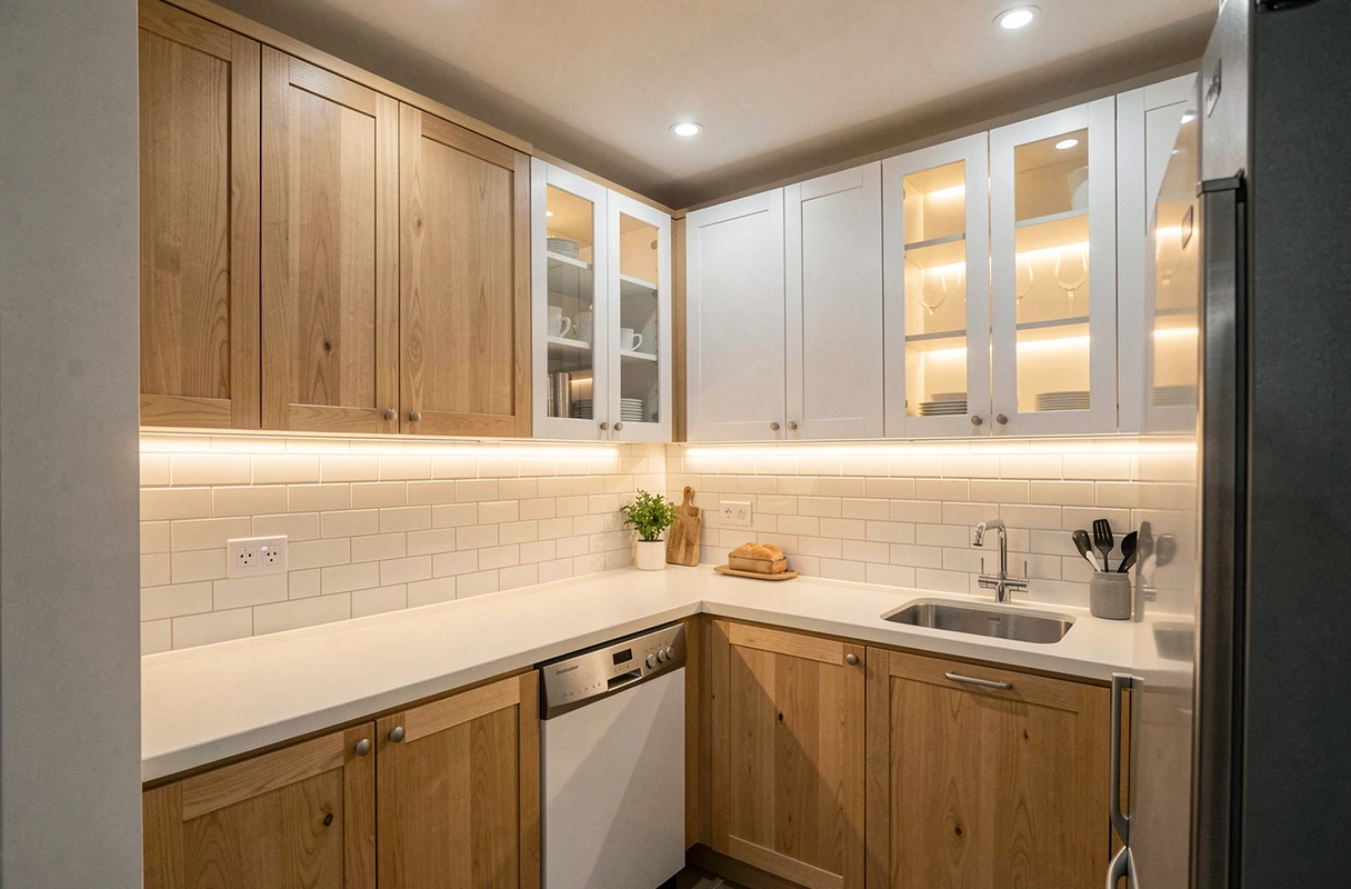
A single central ceiling light creates shadows that visually shrink the room. The idea is to layer multiple light sources:
- LED strips under upper cabinets to illuminate the countertop without shadows
- Ambient lighting integrated into a niche or above upper cabinets to enhance the ceiling
- A directional spotlight or pendant above a focal point (table, island, sink)
This layered approach adds depth to the room. Lighting becomes a tool for enlargement, not just comfort.
6. Lacquered and satin materials to capture light
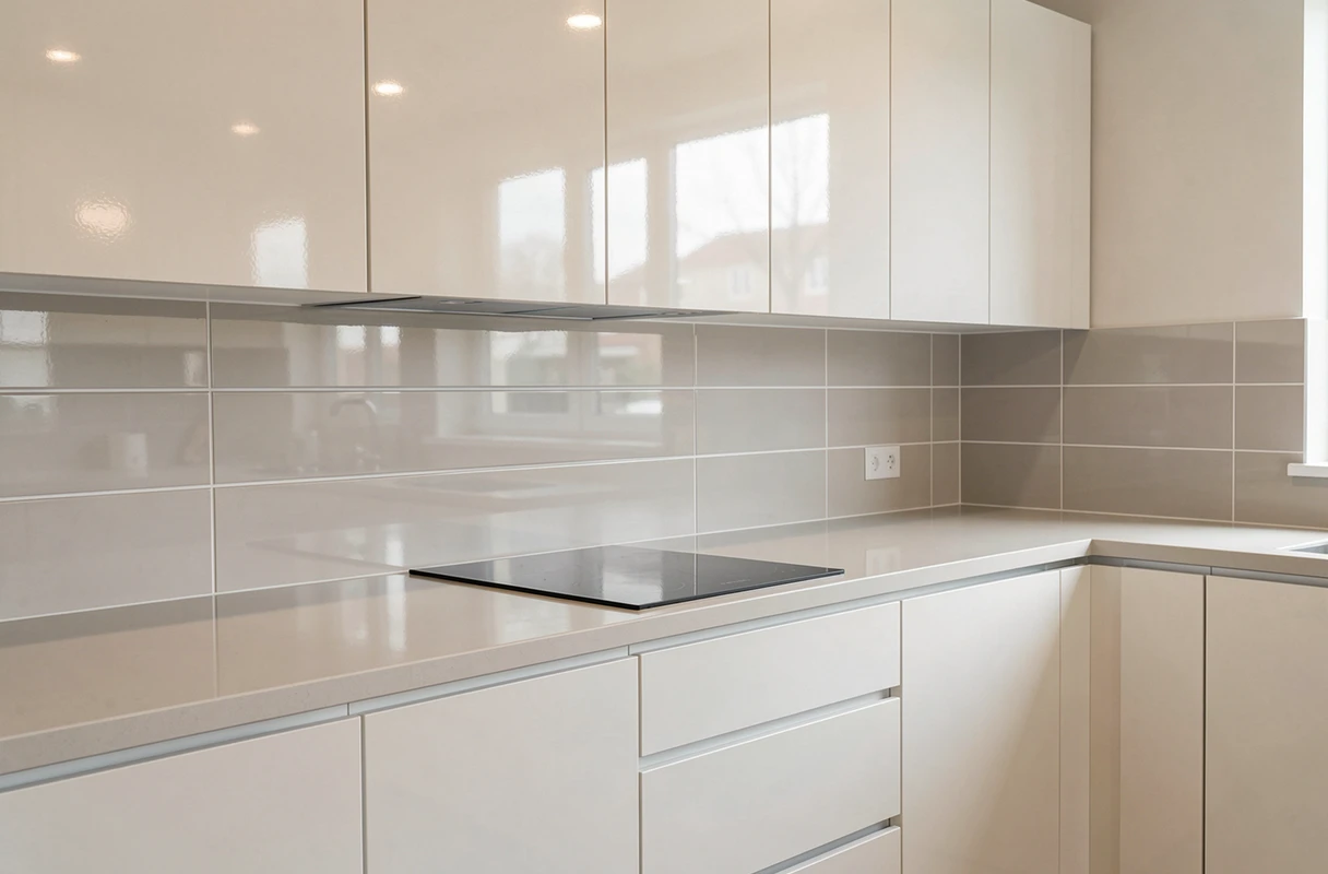
Matte surfaces absorb light. Lacquered or satin surfaces reflect it, creating a light bounce effect from one wall to another. In a small kitchen, this detail changes the perception of space.
Be careful not to overdo it: lacquered facades show more fingerprints. Reserve lacquer for upper cabinets (less used) and keep a durable satin finish for base cabinets and handles.
7. Upper cabinets to the ceiling to eliminate unnecessary voids
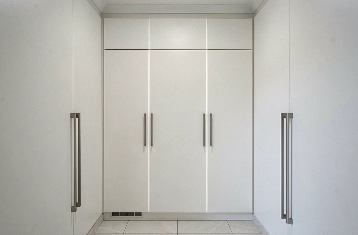
A void between the tops of cabinets and the ceiling collects dust and breaks verticality. Extending upper cabinets to the ceiling produces two simultaneous effects: the ceiling appears higher, and you gain real storage space for rarely used items.
If your current cabinets do not reach that high, a simple cornice or finishing strip in the same shade as the facades is enough to visually close the space.
8. Clear countertop thanks to built-in appliances
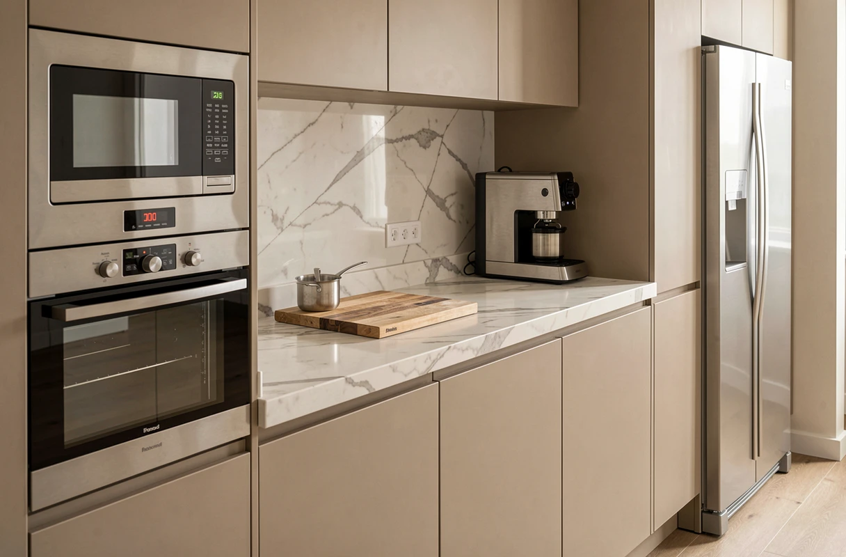
Every appliance placed on the countertop reduces usable surface area and weighs down the visual appeal. A built-in column oven, a microwave integrated into an upper cabinet, or a flush cooktop free the horizontal line of the countertop.
A visually clear countertop gives the impression that the kitchen is larger than it is. It is also a direct ergonomic gain: more space for preparation, cutting, and placing a hot dish.
9. Mirror or glass backsplash to double the depth
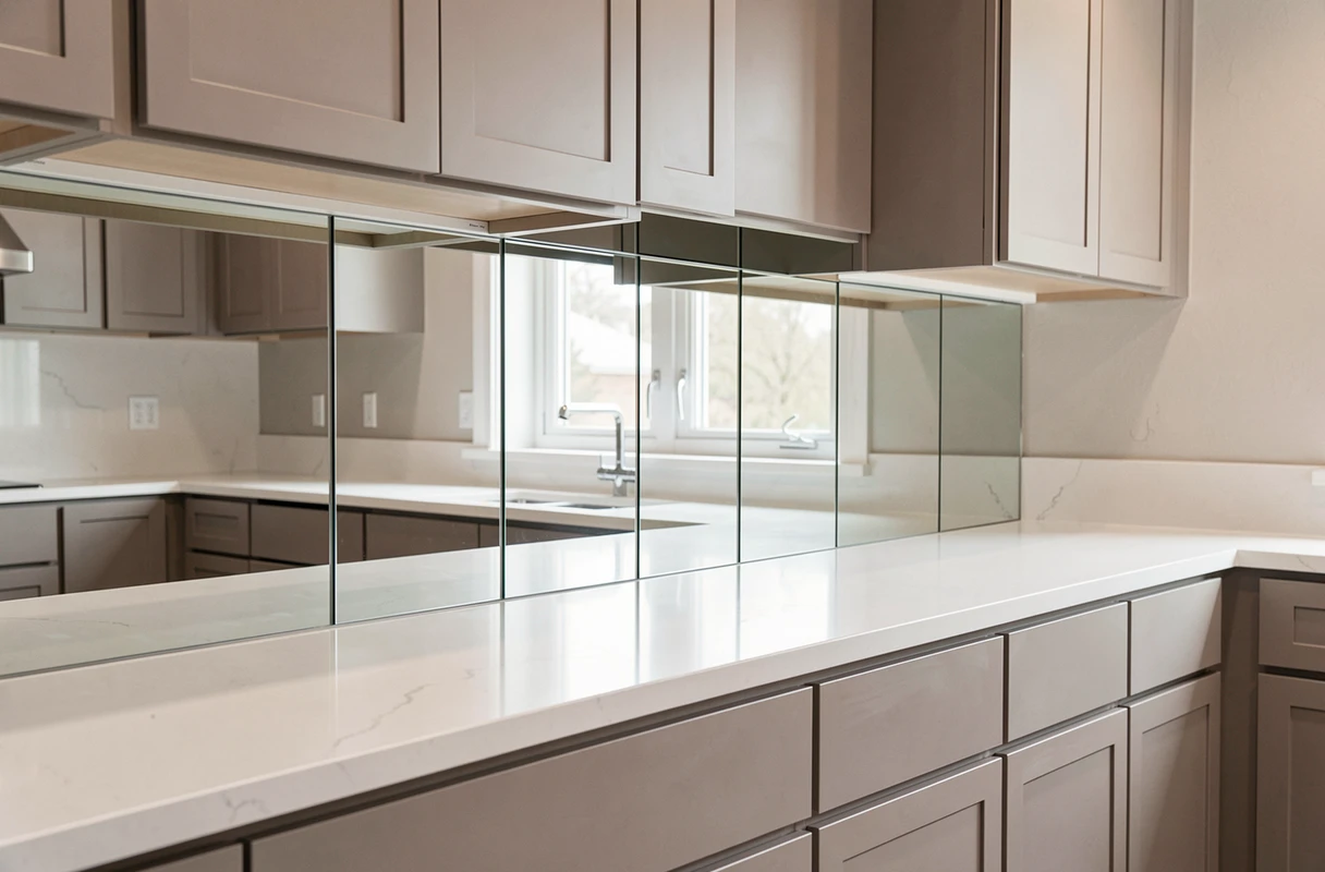
A mirror backsplash reflects natural light and the depth of the room. It is one of the most effective tricks in a small kitchen, provided it is placed on a well-lit wall.
Lacquered glass offers an interesting compromise: it partially reflects light without the total mirror effect that can strain the eyes. It cleans easily with a sponge, making it a practical choice behind a cooktop.
10. Visual opening to the adjacent room without knocking down a wall
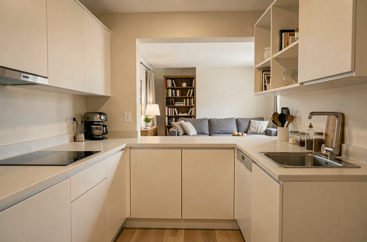
Completely opening the kitchen to the living room sometimes requires heavy renovations. A simpler alternative is to create a pass-through or a half-glass partition. The eye crosses the wall, light circulates, but you maintain a functional separation that limits odors and noise.
Replacing a solid door with a glass door produces the same effect at a lower cost. The kitchen gains in brightness without losing its independence.
Visually enlarging a small kitchen relies less on an isolated decorative choice and more on the coherence between surfaces, light, and storage. Each tip taken separately provides a modest gain. Combined in the same space, they transform the perception of a room without touching its load-bearing walls.